The world does not need more content
There is no shortage of content. There is a shortage of well-trained attention.
Most brands still behave as if memorability is a volume problem. They reach for more: more media, more motion, more adjectives, more assets for every format. But attention is not won by noise. It is won by specificity — the object, gesture, face, texture, phrase, or framing decision that makes a person stop because they can feel that somebody actually saw something before they published it.
That is why MOW is launching a global design initiative: Impossible to Ignore (i2i) — a visual philosophy that begins with a simple belief. Celebrate the unnoticed things made with care, the people with an unmistakable point of view, and the places carrying culture in plain sight.
The unnoticed is the real competitor
Impossible to Ignore's call to action is clear: train the eye to notice. The deeper discipline is cultivating sensitivity — the habit of noticing what other people walk past. That habit runs from the street to the brand: a market detail, a portrait, a name a category has been waiting for, the single object that reduces an argument to one legible thing.
What connects these details is discernment. Discernment becomes taste — the ability to recognize what deserves to be noticed.
The seven tenets
Impossible to Ignore cannot live as inspiration alone. It needs observable proof: tangible signals, human artifacts, real-world texture. Underneath the umbrella live seven tenets, each mapped to a real image, a real observation, and a recognizable worldview.
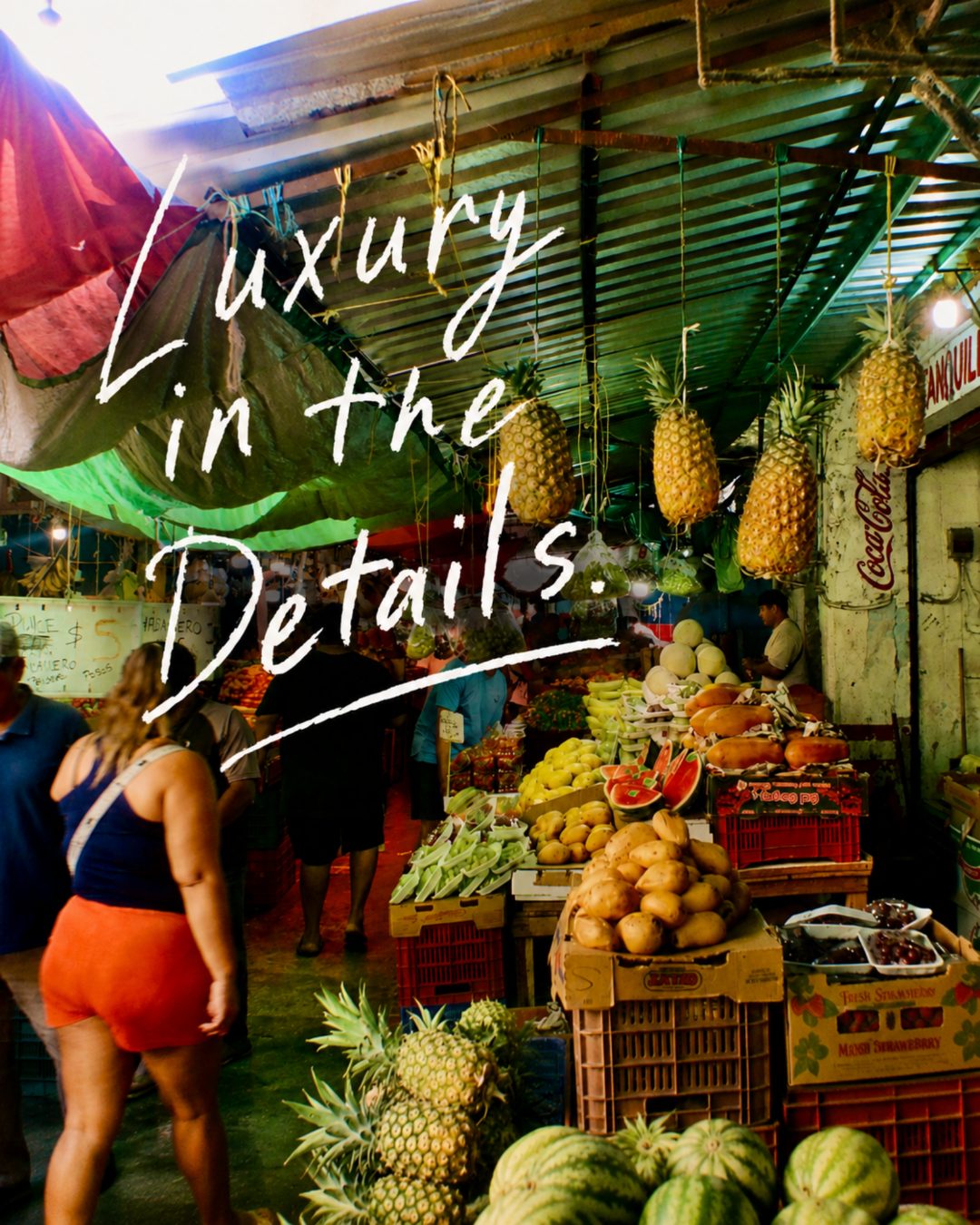
Luxury in the Details
The quality of attention paid to the part nobody was forced to notice — the lining of a jacket, the bevel of a label, the hand-stitched edge of a market awning. When the small thing is considered with care, the whole object carries resonance.
Distinctiveness Over Conventional Beauty
A face with an unmistakable feature, a street in an unfashionable corner, a still life with an awkward shadow — these outperform the symmetrical and the safely pretty because they cannot be confused with anyone else's work.

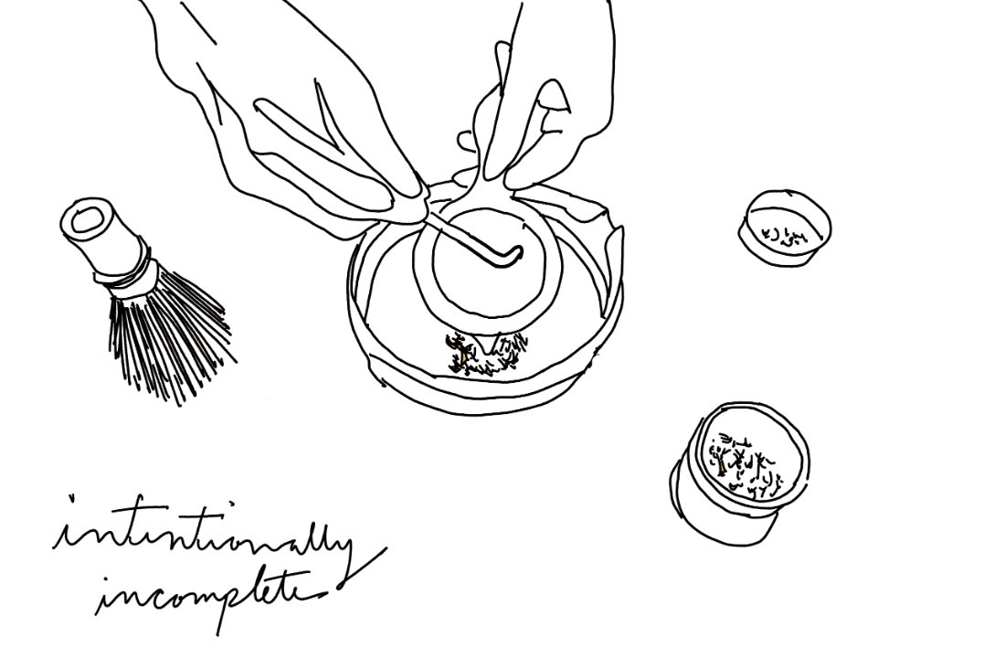
Intentionally Incomplete
Leave just enough out so the audience fills in the omissions — a grand invitation to participate. Give people enough pieces to build the story themselves, with a wink: you already know the answer.
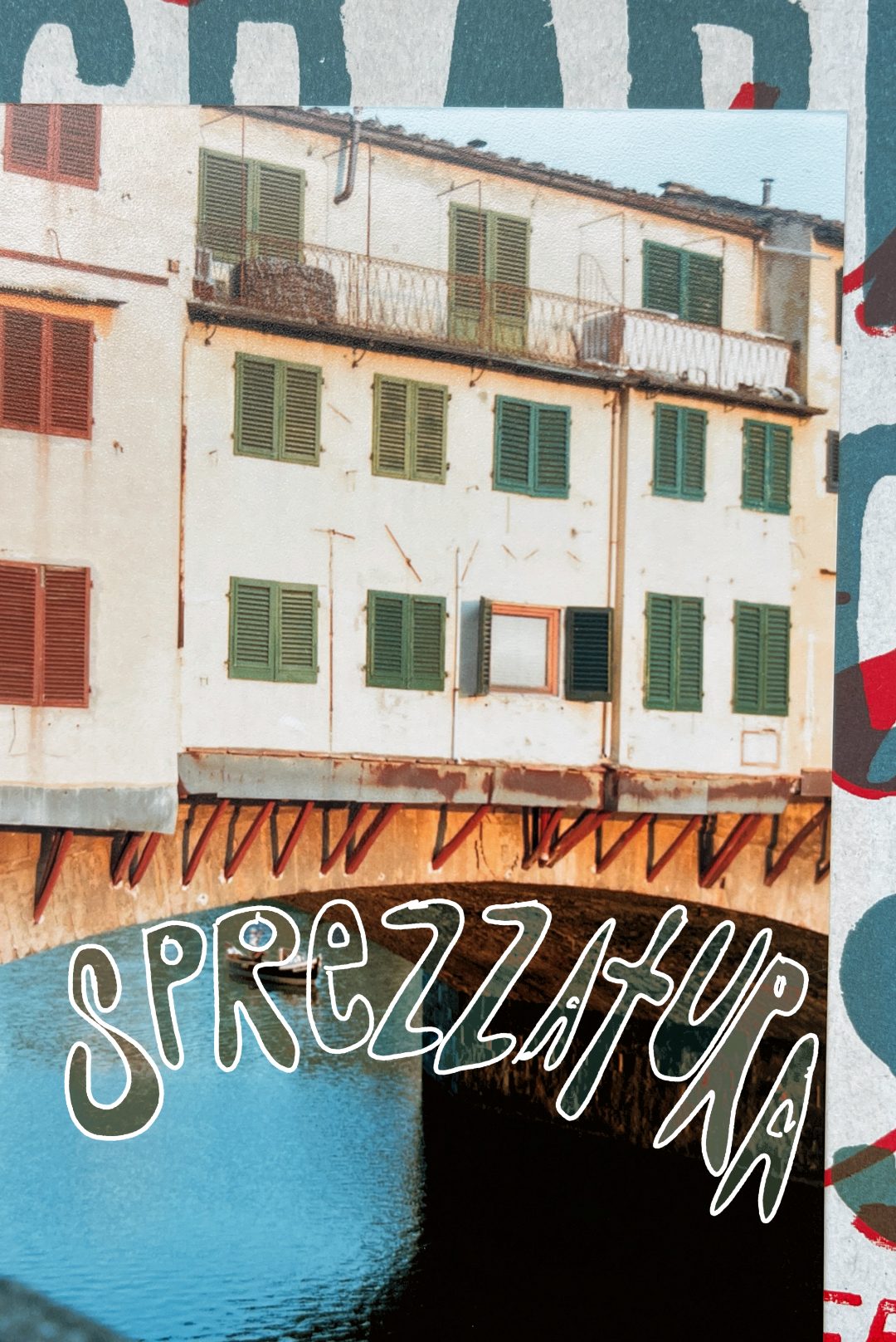
Sprezzatura
The art of making something difficult look effortless. Work agonized over privately, then published as if it cost nothing. It is the through-line of the MOW Method: do the difficult work in private, so the public version feels inevitable.
Absolute Conviction
Owning only the conversation you want to have — the sitter who looks back without flinching, the designer who keeps one typeface for a decade, the brand that knows what it would never publish. Conviction reads in the work because it was present in the decision.

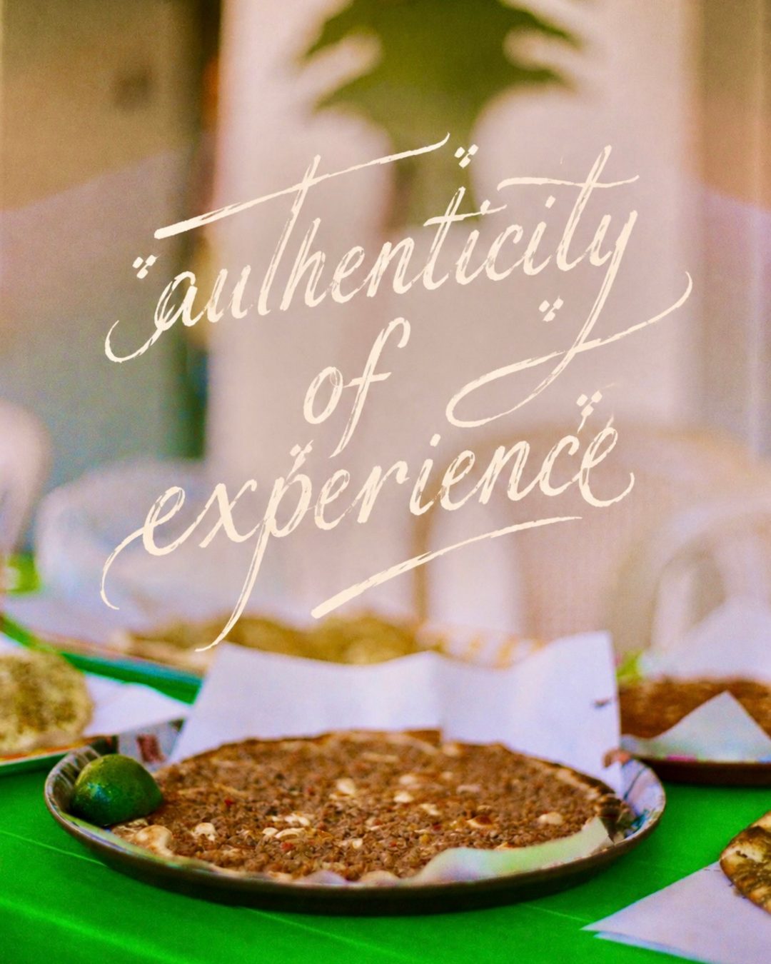
Authenticity of Experience
What remains when a place keeps its own texture — low green stools in Vietnam, espresso standing in Rome, the smile line on a vendor's face in Mexico. The opposite of imported, exported, globalized taste.
Koochooloo — کوچولو
"Little one" in Persian. It introduces softness, memory, and cultural specificity into a framework that could otherwise become severe. Distinctiveness without tenderness becomes cold; the most impossible-to-ignore work usually carries a small, human, lived-in note a boardroom would have edited out.

Global does not mean generic. Keep the standard identical; let the proof stay local.
A campaign should feel coherent in New York, London, São Paulo, Dubai, and Tokyo without becoming culturally anonymous in any of them. The task is not to keep the evidence identical — it is to keep the standard identical. Different streets, different rituals, different materials, one unmistakable eye. The tenets travel; the proof is local.
Why now
The timing is not accidental. Search is changing. AI interfaces are changing. Audiences are changing. The advantage is moving toward first-hand experience, a unique point of view, and non-commodity work that gives people something they could not get anywhere else. Impossible to Ignore is sharper than "lifestyle," more human than "luxury," more durable than anti-AI panic. It names the thing people actually feel when they encounter work, people, and places that carry conviction.
Explore how we put this to work in our portfolio, learn about the MOW Method, or bring us your brand.
Frequently asked questions
What does Impossible to Ignore mean in branding?
Impossible to Ignore is MOW's framework for brand distinctiveness created through authored observation, cultural specificity, and conviction. It describes work that remains memorable because it is too exact to be confused with generic category language or generic luxury imagery.
Why does this matter more in AI-shaped search?
Because AI search systems still depend on clear, crawlable, semantically legible source pages. Google's guidance says the same SEO fundamentals apply to AI features, and recent GEO research suggests that structured, evidence-rich pages are more likely to influence generated answers.
Is Impossible to Ignore just another way of saying luxury branding?
No. Traditional luxury branding often leans on inherited visual signals such as polish, scarcity, or status. Impossible to Ignore shifts the emphasis toward observation, recognizability, first-hand experience, and the details that make a brand feel authored rather than imported.
What role does original photography play in this framework?
Photography is one form the work takes — not the whole point. The deeper discipline is cultivating sensitivity, the habit of noticing what other people walk past, and that habit runs from a street observation to a brand name to a civic-scale identity. Original images are one strong form of proof because they show where a brand has actually been. But a memorable name, a single visual object that reduces a category to one legible thing, and a phrase that other people start to repeat are forms of first-hand evidence too.
Can a global brand use this without becoming generic?
Yes, if the standard stays constant and the proof stays local. Clear local pages, different URLs for different language versions, and explicit hreflang where needed keep the system coherent without flattening local specificity.
Bibliography
Numbered citations and file-cite markers used throughout the essay map to the sources below.
- [1] VoyageLA interview with Peter Weltman of MOW — Third-party documentation of sprezzatura, luxury in the details, conviction before consensus, the MOW Method, the Pedrera billion-dollar Guatemala City development, and the exact phrase "impossible to ignore." Published February 23, 2026.
- [2] BetaKit — "AutoAlign spins off from Armilla AI, launches firewall solution for LLMs" — Trade-press confirmation of the AutoAlign / Sidecar spin-out, the firewall positioning, and the KPMG cooperation. Published April 23, 2024.
- [3] AutoAlign — "AutoAlign Leverages NVIDIA NeMo Guardrails to Protect LLMs at Scale with Sidecar Security" — AutoAlign's own press-release page announcing the NVIDIA NeMo Guardrails partnership for Sidecar, including the white-paper findings. Published June 20, 2024.
- [4] BIOQuébec — Fast, Fair, Cancer Care — Campaign page for BIOQuébec's global initiative calling for publicly reimbursed liquid biopsy. The page links onward to the source press release at Avitia.
- [5] Peter Weltman on LinkedIn — "We dropped two letters and unlocked…" — First-person post from MOW's founder telling the story of how the Pedrera name was found by dropping two letters from the project's working title.
- [45] Avitia — Fast, Fair, Cancer Care source press release — Originating press release linked from the BIOQuébec campaign page, providing additional context on the liquid biopsy reimbursement argument.
- [6] Man of the World (MOW) — Agency site. The home of the philosophy described in this essay.
 Man of the World · Los Angeles